Let us show you around…
The Kitchen: Modern & Moody
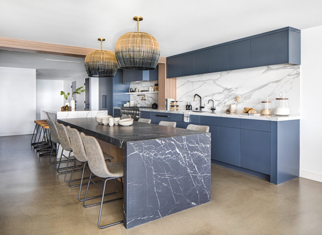
This kitchen came with many surprises and LGI “firsts”. Let’s chat about my favorite (and maybe most proud) part of this kitchen: The eye-catching continuous wood paneling that wraps up the walls and over the ceiling. This is a beautiful design detail that brings warmth and texture to a contemporary space. The idea originated when we couldn’t remove some exposed piping due to building constraints. This solution could not be more perfect and was the ideal way of defining the kitchen to dining space.


Our client wanted a space that could transition from the kitchen into dining for an over-sized entertaining hub so we decided to connect kitchen, dining, and bar into one livable design. The kitchen started as a tiny corner of the home (see before and after below) so we blew out all of the walls and expanded it to fit a double island waterfall.


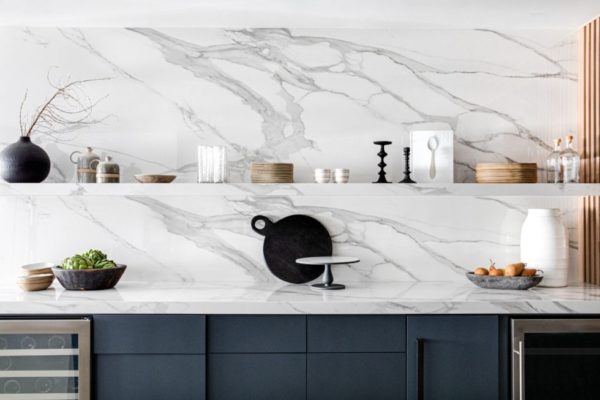
Speaking of the waterfall, let’s talk about the material. Our love for marble will always remain, but because durability was a main focus in this kitchen, we chose porcelain. With all of the dinner parties and wine shared, porcelain was the best marble alternative for this project!
The double waterfall moment was a thoughtful way to mesh these two areas while still making the space feel cohesive. The white porcelain kitchen island falling into the black porcelain slab dining table made a defining statement and created ultimate levels of entertainment for our client. 
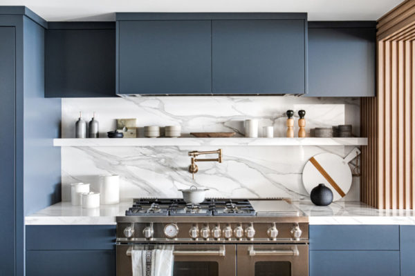
We brought the porcelain from the countertops to the backsplash and integrated open shelving to support everyday lifestyle and frequent hosting. The integrated shelf brings an architectural feel that also allows for exposed daily dinnerware and barware with a few decorative accents to add interest! The contrasting element in this space is the stunning “Edge of Black” paint color by Dunn Edwards on the flat panel custom cabinetry.
Concrete floors were the finishing touch to this moody kitchen! With durability being at top of mind, concrete is such a great option and can easily handle the sand and moisture that San Clemente beach days bring.

The Master Suite: An Ocean Palette


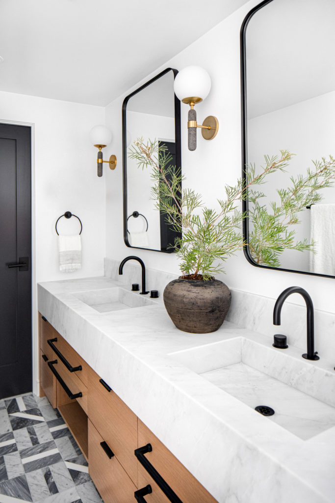
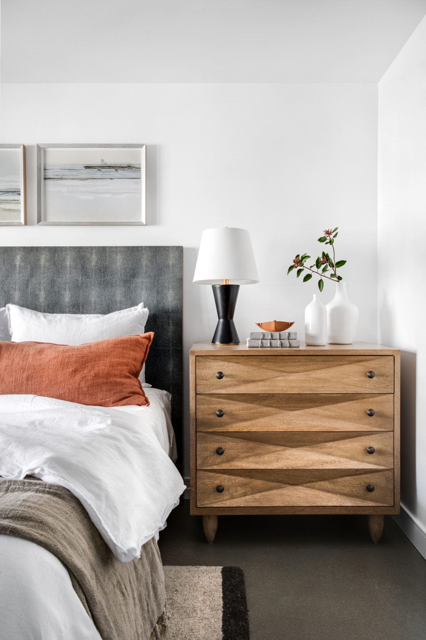
The oceanfront views inspired this stunning master bedroom palette. With soft textiles complementing the neutral palette, we loved playing with texture and scale in this beautiful bedroom. We decided to bring the grey motif into the master bathroom with a fun spin on the modern pattern marble flooring.
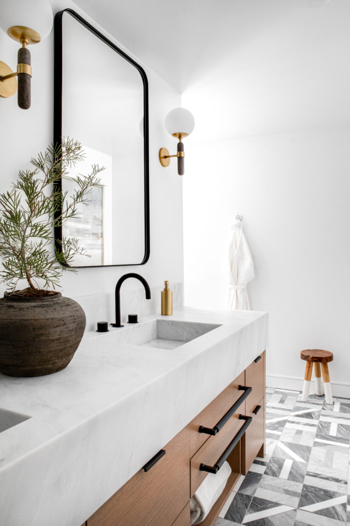

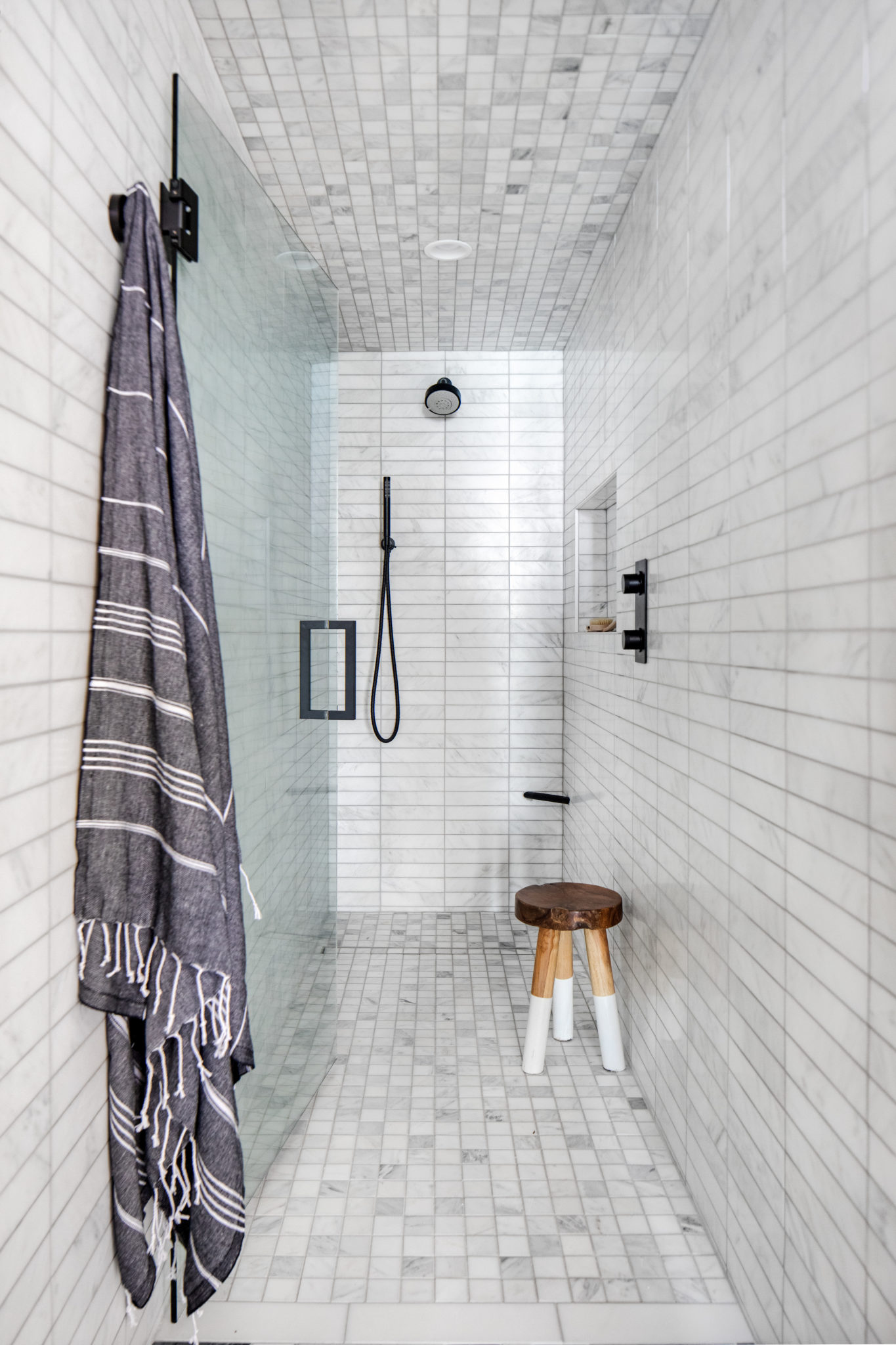
We had to pivot many of our original plans for this master bath. Our vision to move the walls and open the space was challenged by existing plumbing that we could not move. Therefore, we added a lot of interest in other ways. We laid beautiful marble flooring under the custom vanity and added striking marble tiles in the extended shower. The less than ideal circumstances inspired us to bring interesting and thoughtful design to this master bath!
Bedrooms: California Casual
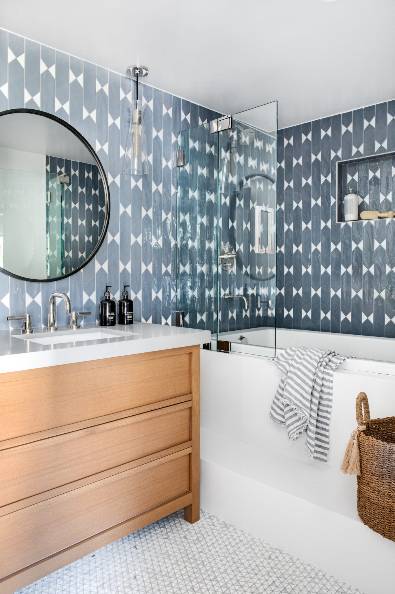
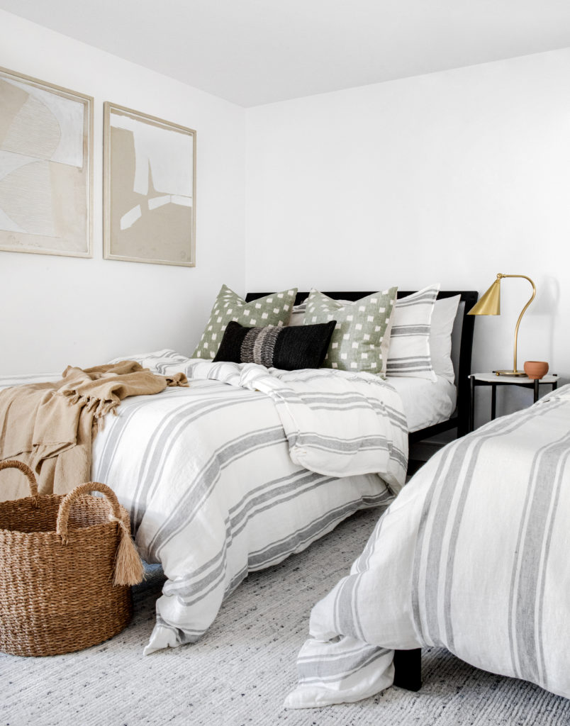
The California casual inspiration was carried throughout the bedrooms and guest bath. Each room has its own pop of color and beachy approach! We love the simplicity of the vanity paired with the bold ceramic blue tile and the neutral palettes in the bedrooms. We also can’t get over those wood nightstands and the natural element they bring! We are definitely seeing double in the youthful kid’s room and aren’t mad about it.
Thanks for taking the tour with us! What’s your favorite part of #LGImoodyoceanfront?
Be sure to follow along with me on Instagram as I share more details about this project in my feed and IG stories!
Xo, LG

