Your living room is the most common gathering space in your home and it’s typically where people spend the most of their time. It’s where you gather for movie nights or book club discussions. It’s where you watch the football game with your family and friends. Since your living room is the focal point of your house, it’s important to make it a well designed space that impacts how people experience your home.
As one of the top full-service interior design firms in Orange County, my company, Lindye Galloway Interiors, knows a thing or two about elevating your living room. In fact, I know that elevating your living room can elevate your entire home.
I always recommend starting your design in the living room and then working on all of the other rooms after that so that you really have a cohesive look that starts from the center of the space.
There’s a lot of mistakes you can make when redesigning your living room. Things can be out of place. It can look cluttered, messy. But we have the perfect ideas to help you transform your living room into the go-to spot for your family and friends alike.
Related: How to Create an Entryway That Makes a Statement
LAYER TEXTURES
A lot of times, living rooms will have a color scheme. There will be one or two main colors that define the overall look of the space. To keep your living room from becoming too monochromatic, we recommend that you make the room feel really tactile. Mix in rugs with different textures, use a mix of wood and leather in your furniture. This gives the room some personality without overwhelming the eyes.
I also suggest starting with your sofa. Add throw pillows with a different texture than your coach, or even have a blanket draped over the side. This can add a bit of personality and pop to your living room without much effort.
DECORATE WITH MEANINGFUL OBJECTS
Oftentimes we can get easily caught up in the seriousness of design. You want it to look a certain way. You want high quality pieces. You want things to be placed just so. But something that you should always keep in mind is showcasing at least one meaningful object. This can help tell a story, even shaping the rest of the living room. Or it can simply be a break from the sleek designs and perfectly placed pillows to show a bit of your personality, your life, or your family.
It could be an antique your dad collected and treasured in his own home or a handmade pot your child made in school. It gives the space more soul and adds a bit of comfort for you and your guests. It doesn’t even have to be a centerpiece — when your friends finally notice it, they’ll love to hear the story.
ADD DRAMA WITH SMALL DETAILS
Small details can add character to your living room without overwhelming the overall design. This can be in the form of unique characteristics on the furniture or little pieces on the coffee table. This is something that I often do for their high-end residential and commercial projects.
This is where a lot of people will add a lot of clutter to their shelves, to their coffee tables, to all their different surfaces. So keeping it clean and simple with more negative space in between is more visually appealing than having overly cluttered spaces.
Instead, pick a rug with tassles for some added flair. Or pick furniture with a certain texture that pops against the rest of the decor.
ACCESSORIZE YOUR CEILING WITH LIGHT FIXTURES
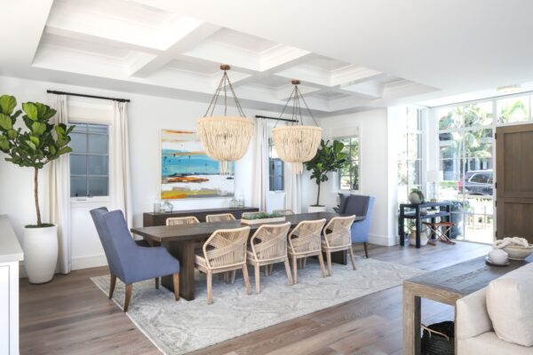
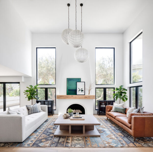
Sometimes ceilings can be overlooked when it comes to designing, but to truly transform a living room you have to focus on all the walls. Lighting fixtures can easily create certain vibes or aesthetics that will naturally drip down to the rest of the space. Light fixtures are also a way to bring a modern feel to your home.
When you are thinking about your ceilings, think about how you want multiple touch points throughout the space. You want to visually be able to look at the ceiling, the walls and the floor and have an experience with all of that.
USE HANDMADE PIECES
A lot of times, newly constructed homes have that sleek simplicity that sometimes can come across as cold. To avoid that feeling of detachment from the living room space, utilize handmade pieces in your design. Create a sense of warmth with handmade rugs or one-of-a-kind furniture, whether it’s created by you or someone you met at a farmer’s market.
Another way to incorporate handmade pieces is on your walls. A lot of times, people will purchase wall art that’s mass produced at chain retailers. I want to warn you that this can sometimes come across as inauthentic and cheap. Try commissioning artwork from a friend or buying art online that is unique and speaks to you personally.
Art also breathes life into a space and allows you to express yourself, your personality, and your own style. That’s typically the last layer that actually speaks more to who you are while the rest of your furniture can be neutral and can be easy to change in and out. Art is one of those things that you’ll want to invest in and splurge on, so it’s something you can carry with you for years to come.
HANG UP ARTWORK

Honestly, nothing shows off your room’s personality more than artwork so here’s a bit more about that. It’s the perfect way to not only decorate your walls, but send a message and create a vibe. The artwork you pick should have a balance between flowing with your overall design (through similar colors, shapes, themes) while also standing out and making an impact on guests.
And don’t forget about the size of the artwork, too, when considering a piece.
People often will also hang artwork incorrectly. Usually we find that the scale of the artwork is the biggest problem when people are selecting the right artwork for their space. Sometimes they will put something on the wall that is much too small or much too big or isn’t placed properly in this space. So finding the right size and hanging it accordingly is the best tip there.
MERGE DIFFERENT STYLES AND AESTHETICS
Don’t feel trapped in a certain style just because of your house’s construction. Feel free to marry your home’s original design with your new vision, incorporating two styles together in a seamless way. This may take some finessing, but in the end you’ll wind up with a living room that’s all your own.
I usually like to pick two or three different styles. So say we have a house that has more of a Spanish flare, but our clients want something more modern. We will mix in a little Spanish and modern, but we really try to keep it to two or three styles that marry well together so that we can incorporate different pieces that speak to those styles.
Related: THE DESIGN PROCESS: HOW LGI WORKS WITH CLIENTS
CHIC STORAGE IDEAS
One thing that no interior designer wants is clutter. But what do you do if your living room isn’t too big? How do you ensure the space is still comfortable and organized when you’re not working with a lot of square footage. That’s where storage comes into play.
Especially in Southern California, something we always consider is the storage space. So when storage is limited, thinking about different storage options or different solutions that can also add elegance to the space will be important.
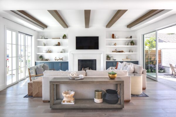
One big thing we like to do is with built-ins by the fireplace or where the TV wall is, is to create some cabinet storage below and some open shelves above so you have plenty of space to be able to tuck away blankets, gains, everything that you might need to hide a little bit of.
Basically make things easily accessible while also allowing them to stay hidden until they’re needed.
TURN SMALL SPACES INTO READING NOOKS
Small spaces can be completely transformed if they are given a purpose. This makes them seem purposely small and cozy instead of cramped and out of place. Make a small space into a reading nook or artists’ corner — and give it a certain vibe. This makes it not only useful, but gives it a personality to coincide with the rest of your living room. This will become a place people will naturally gravitate towards because of its sense of intimacy and purpose.
This means your little reading corner shouldn’t just have a desk or chair, but some welcoming touches that make it seem comfortable and inviting.
So layer in even a chair with a blanket and a throw pillow in a small corner, and that will not only fill the space, but could give you an intentional little space to hang out.
TAKE IDEAS FROM LOCAL LANDSCAPE
While your interior design can be all its own, without focusing on your home’s architecture or exterior appearance, sometimes the outside world can carry a lot of inspiration. If you live near the beach, bring those elements in with vintage light fixtures, walnut wood finishes and interesting textures like rope. Maybe you live near the forest. Take inspiration from the trees and the colors of the flowers outside your home.
This kind of design is especially impactful if you have large windows that allow guests to see the local landscape from within the living room. Even if it’s as subtle as the lines or the small touches of the furniture, people will subconsciously feel a connection to the world right outside the window.
USE FURNITURE TO BREAK UP BIG SPACES

Sometimes having too much space isn’t ideal design-wise. Oftentimes, interior designers will break up a large open space into two or three destinations within the same room. How you place furniture will greatly affect how your guests interact with the space.
I believe a good focal point to work off of is the coffee table. You want to make sure it extends the entire length of the sitting area, about 18 to 20 inches from the sofa or seat. The placement of the coffee table will ultimately decide how comfortable your guests are, since its placement can make a room look smaller or appear too spaced out.
Other furniture that’s often used to break up space is sofas and rugs. By adding a rug, you’re physically establishing a separate area that people can easily recognize upon entering the living room. Make sure the area with a rug is given a focus, like being a little sitting area. Sofas also clearly separate spaces within the room and offer different seating areas throughout the space.
INCORPORATE ANTIQUES
At Lindye Galloway Interiors, vintage and antique products are often utilized in the designs. This can add an interesting story element or vibe to your home that no modern piece could ever replicate. Often, older furniture and antique pieces are built a lot more durable, making them high quality pieces that speak to designers of the past.
Their dramatic feel and eye-catching designs can also make them a great focal point in your living room, even carrying the overall design. Use their unique touches and designs to inspire other elements of your space, creating a look that blends new and old in a brand new way.
CONCLUSION
As you go to design your own living room, make sure to remember that it’s all about balance and skill. You want it to feel like a space that belongs to you, that’s unique to your aesthetic, but also utilizes design elements that are tried and true. You want a blend of meaningful objects and unique antiques as well as statement, high-quality pieces that define the space and how people should interact with it.
In the end, it’s all about showing off your own flair. It’s all about being creative and getting inspired. You don’t have to follow all of our advice perfectly. Instead, choose the ideas that make the most sense for your home and do it in your own way.
If you’re still looking for some help elevating your living room, contact Lindye Galloway Interiors so we can help you create a beautiful space that’s all your own.