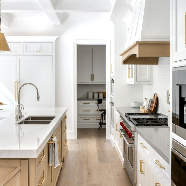
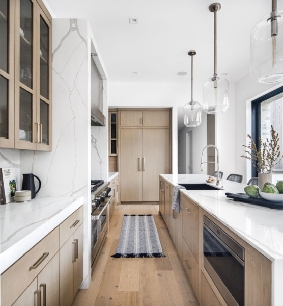
White paint colors are one of our most-asked questions as an interior design studio. There are so many options and we get it, the decision is a tough one to make! We are going to walk you through our white paint process and give you all of our favorite colors and brands! Paint is truly all about lighting. You will know when it is the right shade when the light hits your space more beautiful and when the time of day becomes more defined.
Looking to update your home? Lindye Galloways can help.
Shades of White
White paint can soften or create sharpness in your space, so consider all types of white shades. There are taupe shades, more yellow shades, grey, purple, and green shades. You can have the essence of any hue when looking at white! If we’re deciding on a paint color, we like to put up three or more samples on the wall and look at how it casts in your space with the different lighting of the day and just throughout the house, especially if this is for more than one room.
Neutral Whites
Neutral whites are hues that can pretty much go with anything and look good, no matter what aesthetic of home you’re going for. There is just a naturalness to these whites that can benefit your furniture, art, and accessories or be starker.
“Pure White” by Sherwin-Williams
Pure White by Sherwin Williams has a little bit of a creamier effect, so it’s a bit milkier, allowing for a very soft look.
“Decorator’s White” by Benjamin Moore
The decorator’s white is more of a pure white and is great for a bright and airy space.
“Marble White” by Benjamin Moore
Marble white is much more creamy with a yellow undertone and is the perfect hue when you want to add a little bit of a warmer and more yellow hue to your space.
“Simply White” by Benjamin Moore
Simply white is a go-to staple for most rooms because it is the perfect blend of a warm white and a cool white, and it’s very transitional in its tone.
Related: The Top Trending Paint Colors For Fall
Cool Whites
Cool whites are typically used in a more modern space where you would like to be a little more crisp and cool. They are a little bit more stark and sort of mix in the light grey tones instead of going more warm and yellow.
“Paper White” by Benjamin Moore
Paper white is an excellent example of a tone that has just a little bit of light grey. It’s perfect when you want to add a little bit of contrast to the walls and if you’d like a contrasting white trim on your baseboards and windows.
“Cool December” by Dunn Edwards
Cool December is one of our absolute favorites. I would say we’re using this most in homes. It is sharp and refreshing, but still has that perfect amount of neutral-ness to it that we put it in many spaces where we want to add a hint of a more modern white feel.
“Chantilly Lace” by Benjamin Moore
Chantilly lace is a crowd-pleaser. I think that it looks great in every room that it’s put in. It’s that perfect blend of warm and cool while remaining subtle.
“Frostine” by Benjamin Moore
Frostline is as white as it gets. This is a paint color meant for a super contemporary space that you want to stand out and be very stark.
Related: Beach Modern Home Tour
Warm Whites
Warm White paint colors are very easy to coordinate in ant room in the home furnishings and floors. You can use these colors on ceilings and woodwork next to stronger neutrals, reds, and yellows, or try a combination of two whites to give a subtle depth to a room without becoming too colorful.
“Pointing No. 2003” by Farrow & Ball
Pointing No. 2003 is a super creamy color that almost has a milky-like texture.
“White Dove” by Benjamin Moore
White Dove is another favorite when you just want something classic, softly shaded with white and kind of a grey luminance.
“Snowfall” by Benjamin Moore
Snowfall is a really beautiful paint color that just gives this mellow, restful white and adds radiant warmth to any space.
“Alabaster SW 7008” by Sherwin-Williams
Alabaster is creamy and almost has a taupe undertone, making it a symbolic hue of new beginnings.
Picking the Perfect White
Picking the perfect white is all about your design, aesthetic, and direction you’re taking your home. If that means going warmer with a more organic aesthetic and vibe, then we recommend picking one of the three warmer shades and moving forward with swatches on the wall to check out their ambiance throughout the day, or if you are going for something super modern and stark, then a contemporary cool color would be best for you to really help those cooler tones and hues shine with the paint color.
For more guidance and help check out the Lindye Galloway website.
Closing Thoughts
White paint is something that can be interpreted. we don’t think that there is a right or wrong to white paint, although we do believe that there’s a best and better “white paint”. So feel free to use these tips and tricks and these shades to start your journey, and hopefully, one of them is the perfect shade of white for you.